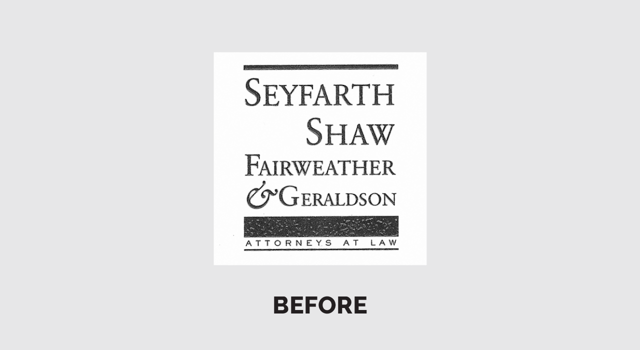
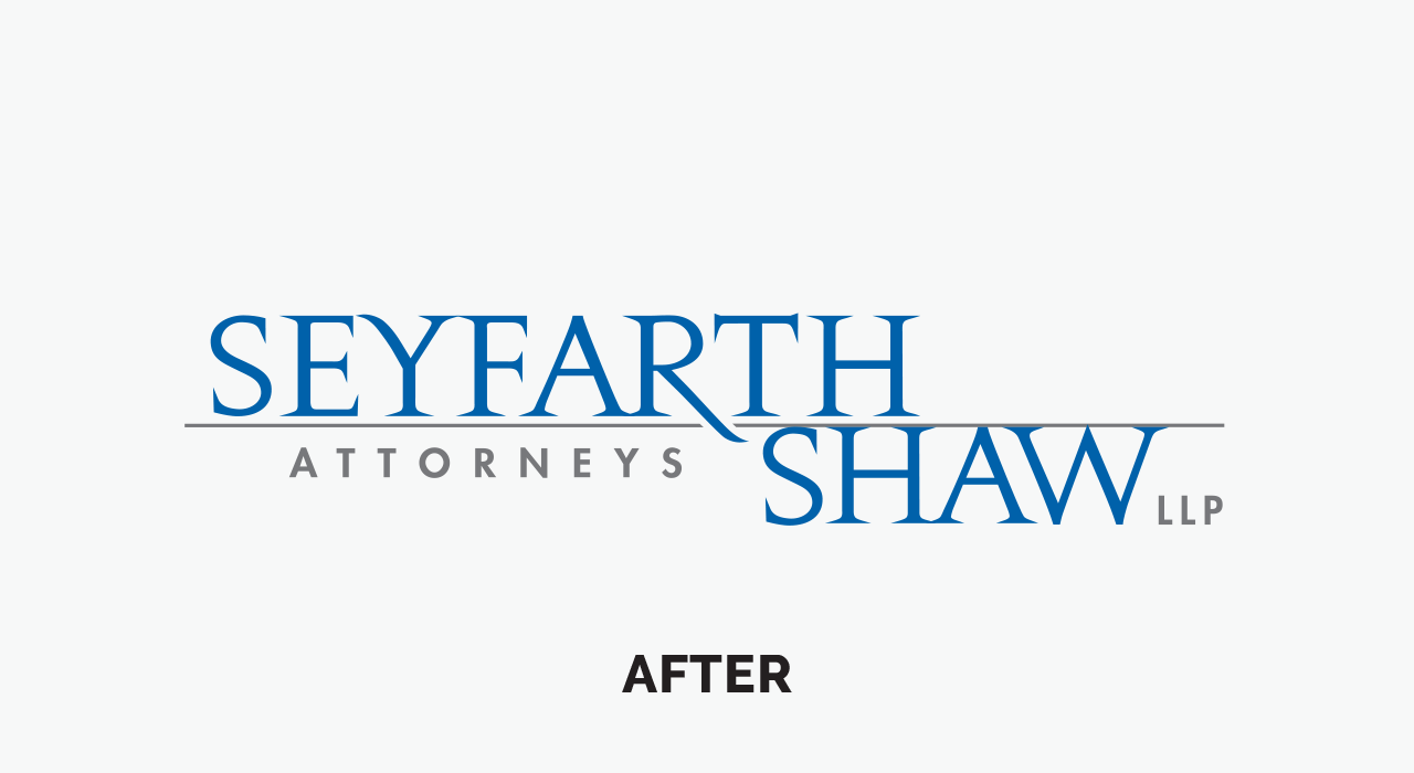
In 1999, we were selected from a number of competing design firms across the nation to rebrand the Seyfarth, Shaw, Fairweather & Geraldson law firm. The firm decided to shorten its name to Seyfarth Shaw, and we began the brand revitalization initiative by designing a new logo. A careful balance of classic and contemporary was achieved in this mark, chosen through a democratic voting process among the partners.
Logo Design
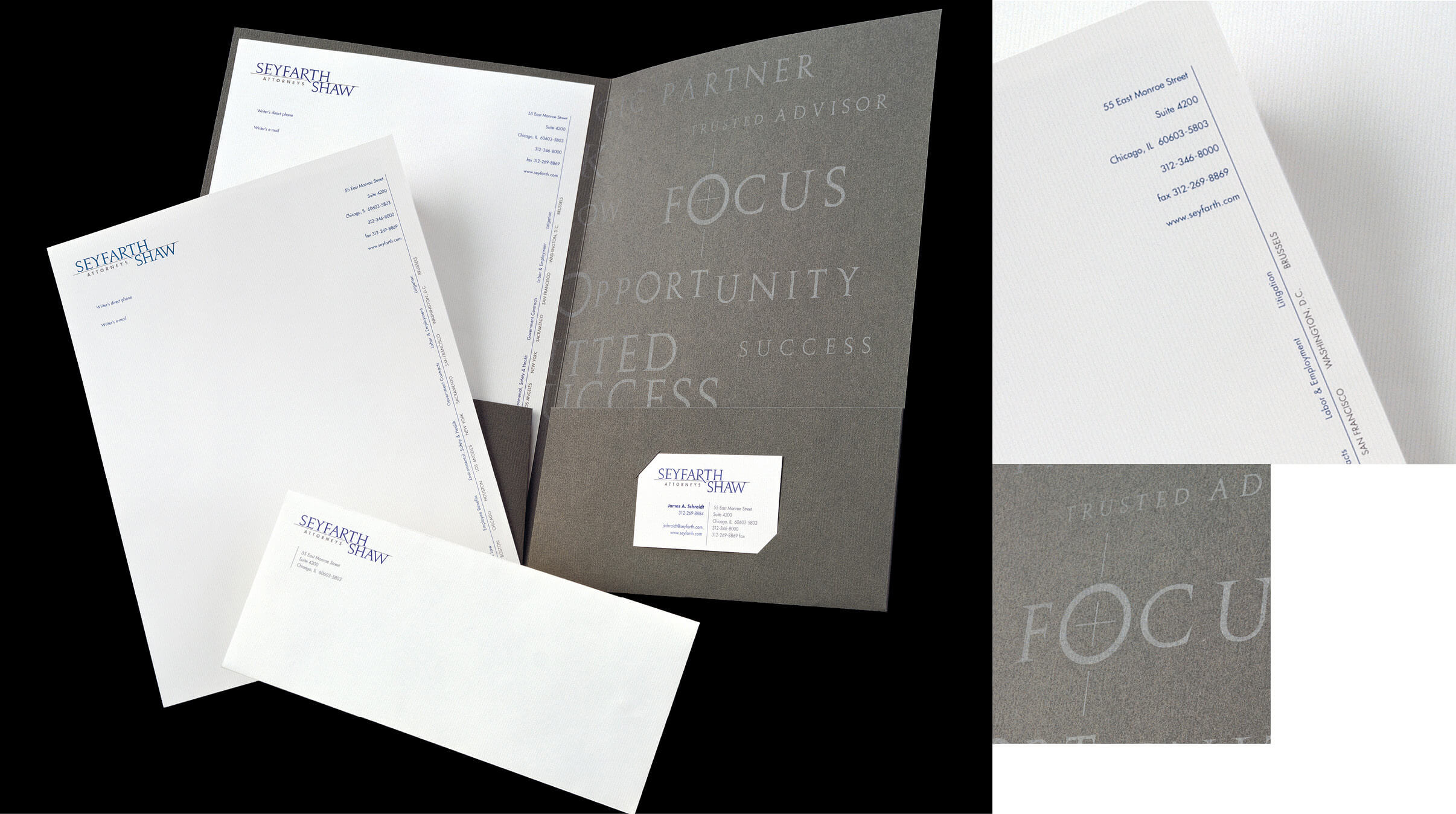
Stationery
Once the new logo was chosen, we began designing a complete system of stationery and communication materials that revealed the firm’s modern attitude while maintaining enough of a traditional feeling so as not to seem inappropriate. The use of pinstriped paper, grey-flannel cover paper and vibrant blue and traditional grey ink colors — coupled with a more modern, non-traditional approach to design and implementation — retained the client’s link to tradition, while positioning it firmly in today’s competitive legal world.
One of the goals of the rebrand was to change the perception that Seyfarth Shaw only did employment law and only practiced in Chicago. On every piece of collateral, including the letterhead, we listed all of the firm’s practice areas and offices, to reinforce that it was a national, full-service law firm.
Marketing Materials
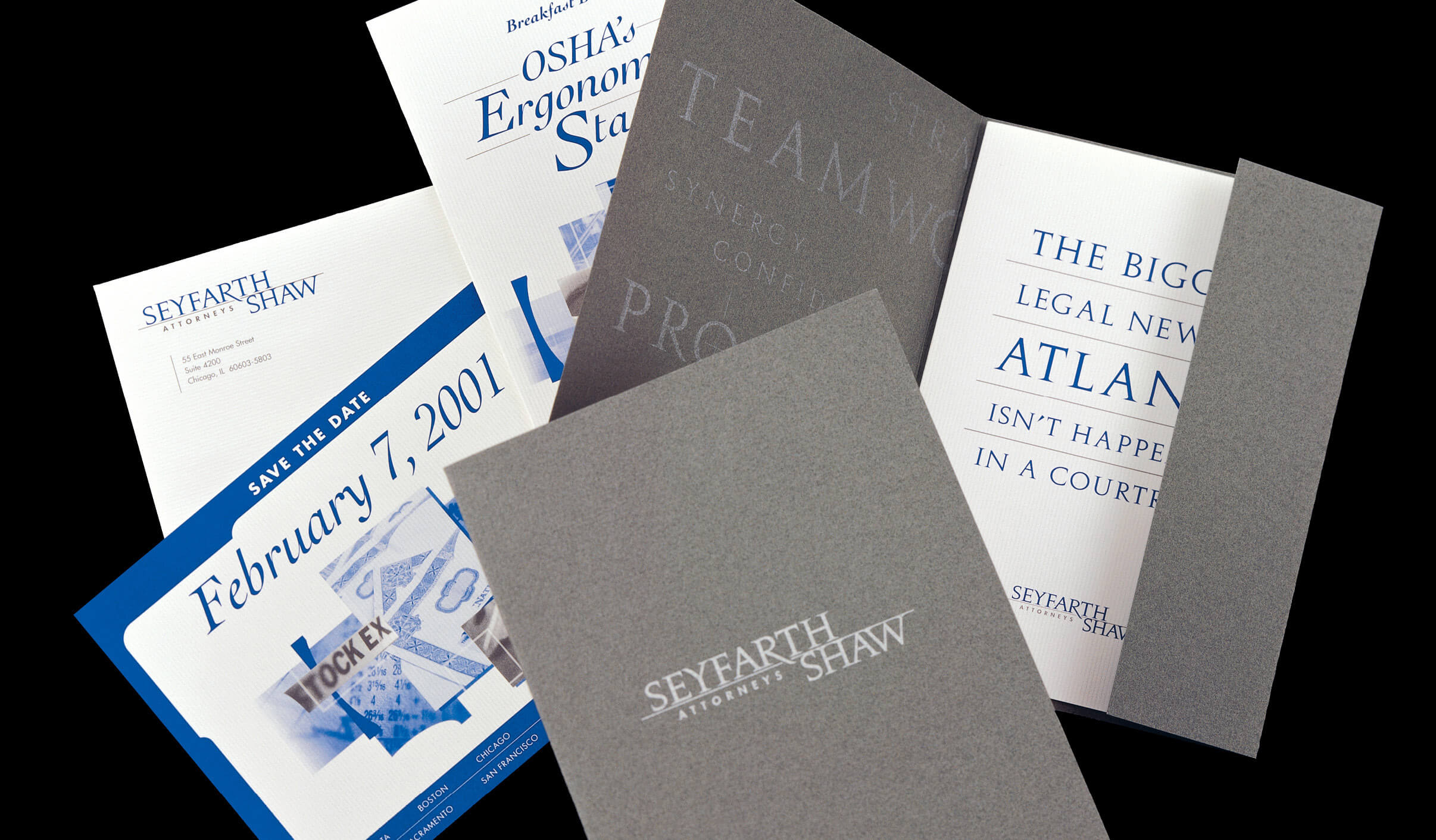
Invitations and Announcements
This system of invitations and announcements — including everything from 2- and 4-color single cards to multipage event guides — adopts and expands the language of the new Seyfarth Shaw identity into an effective and flexible system that combines the traditional vernacular of the law firm with an unexpected approach to design and implementation.
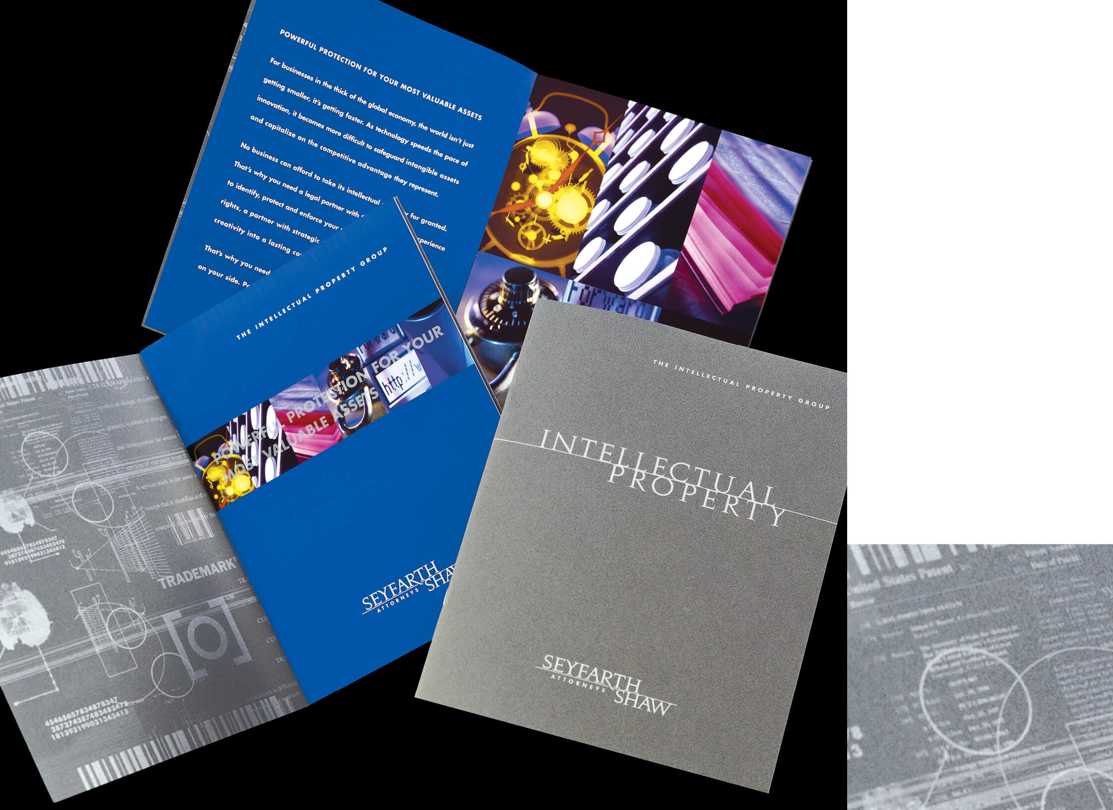
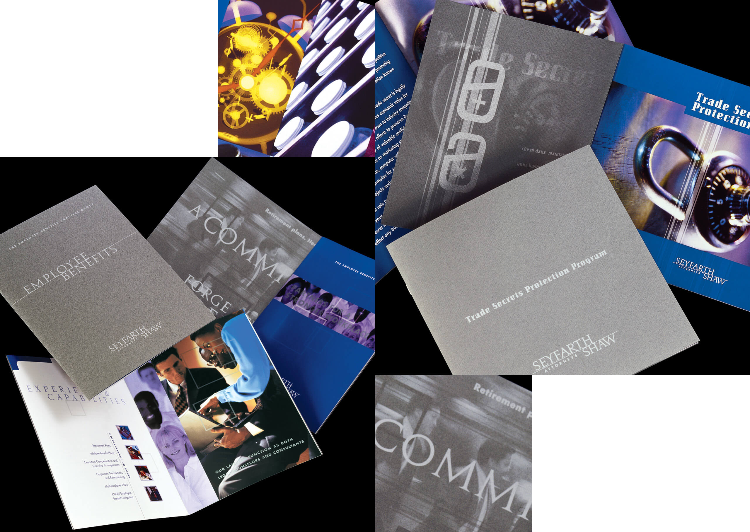
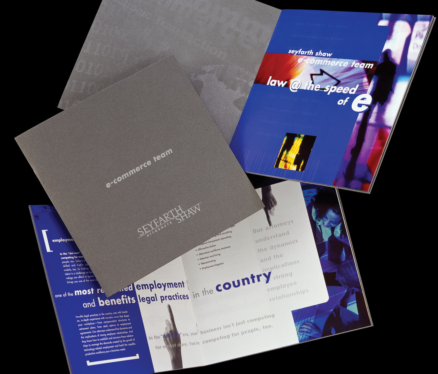
Brochure System
This suite of brochures was designed to work as a system so that, when used together, the only difference on the outside was the practice area or cross-disciplinary team title. The fabric-like grey flannel paper nods to the traditional law firm look. But once opened, each brochure takes on the personality of the group it is representing. Innovative printing techniques, vibrant imagery and a flexible, yet standard, typographic system allow each piece to accurately capture the essence of its content, while maintaining consistent graphic standards.
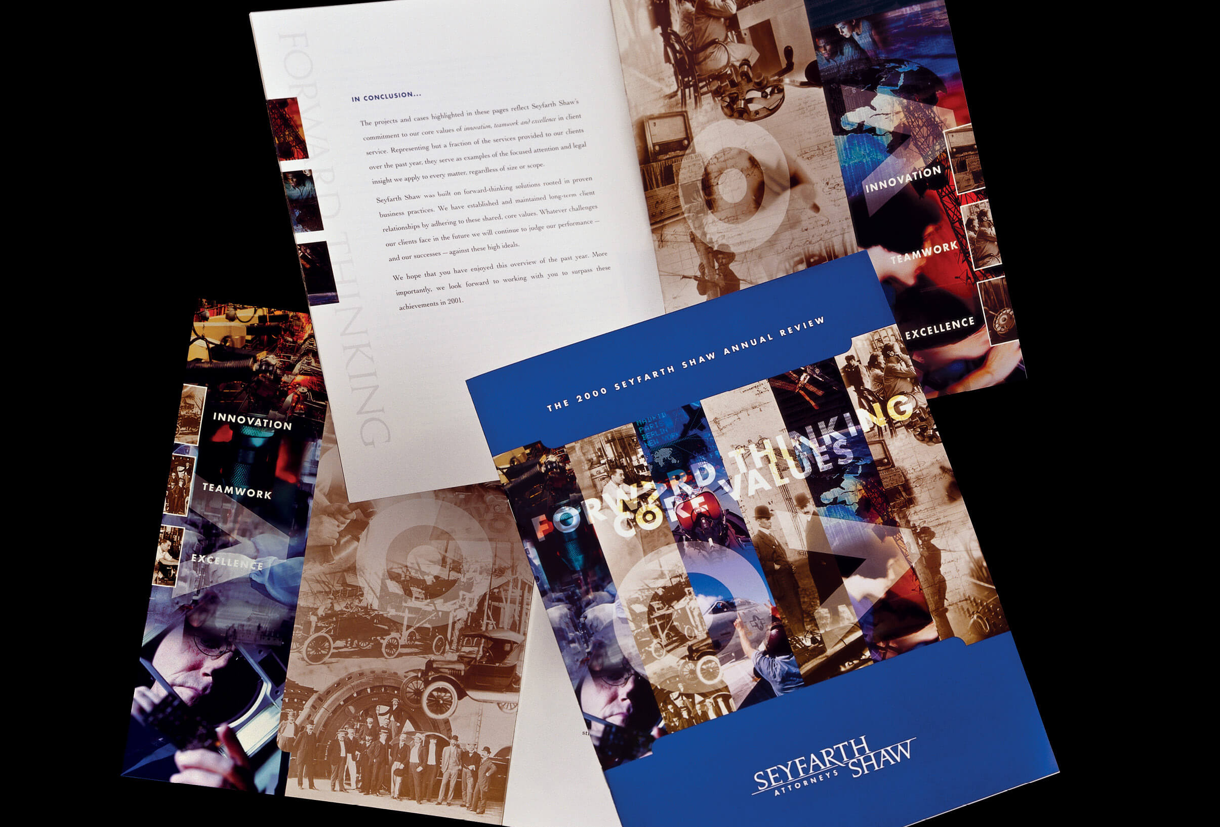
Annual Review
This year-end Annual Review of Seyfarth Shaw’s entire practice integrates the firm’s visual language with a theme of “Forward Thinking, Core Values.” Utilizing vintage imagery and contemporary photography to illustrate the evolution and integrity of forward-thinking ideals, this book captures the firm’s pride in its past achievements, while looking ahead to future successes.
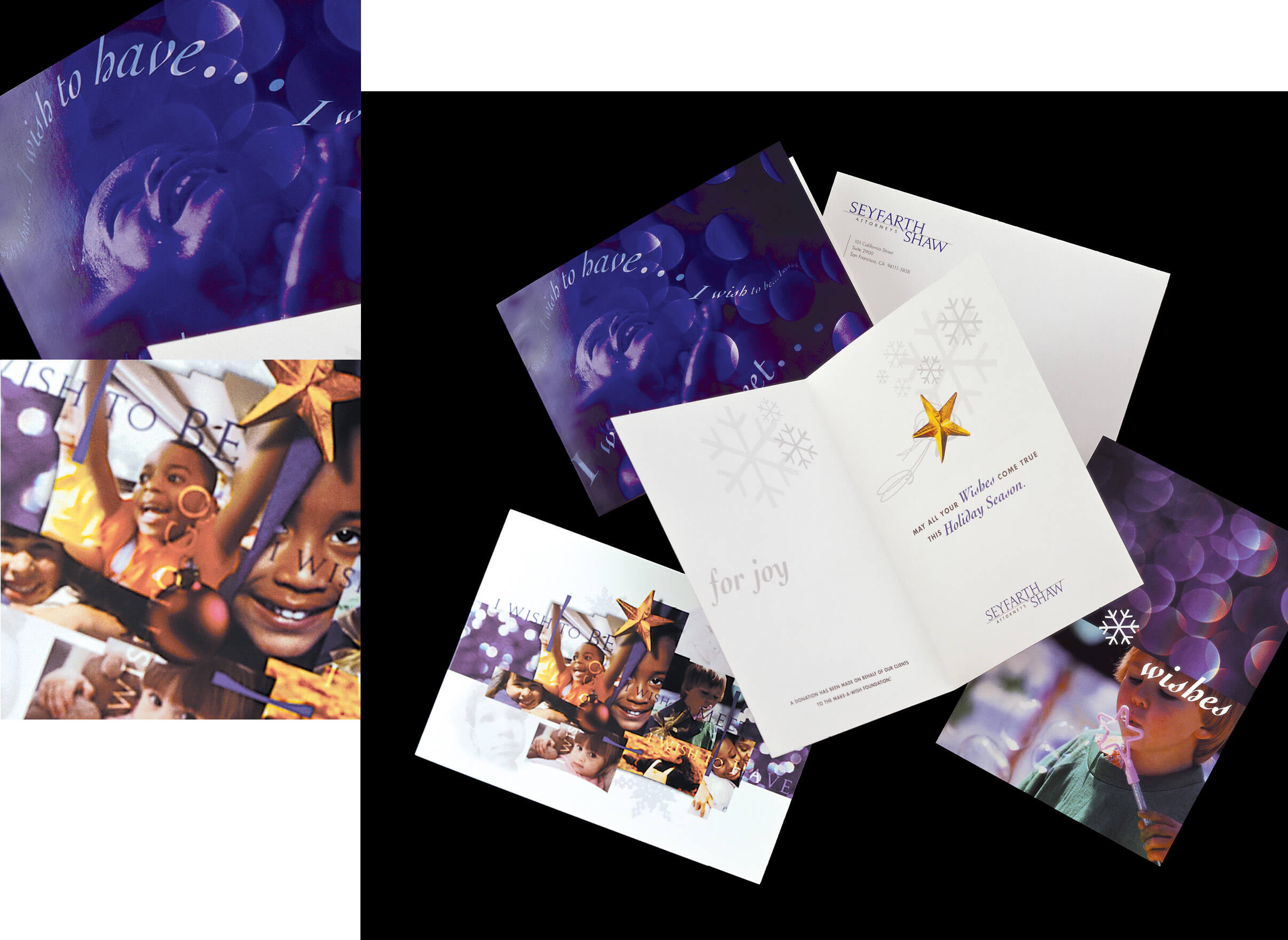
Holiday Cards
These holiday cards for Seyfarth Shaw capture the spirit of both the firm and the season, as well as the mission of the Make a Wish Foundation, the recipient of the firm’s holiday donation. Six card designs were chosen and voted on by the partnership, and three were printed. Attorneys could choose one that best fit their personal tastes, and clients of the firm would not receive the same card many times over.
Training Program
Seyfarth Shaw at Work is a training program that helps make human resources professionals’ jobs easier and the process of legal training less intimidating. This stationery system uses legal imagery and typography in a way that positions the group as contemporary partners in legal employment training. It is also printed on the same pinstriped paper and uses the same typographic standards as its parent company, Seyfarth Shaw LLP.
The brochures for Seyfarth Shaw at Work’s programs feature icons and topic-specific imagery that were developed for each training module.

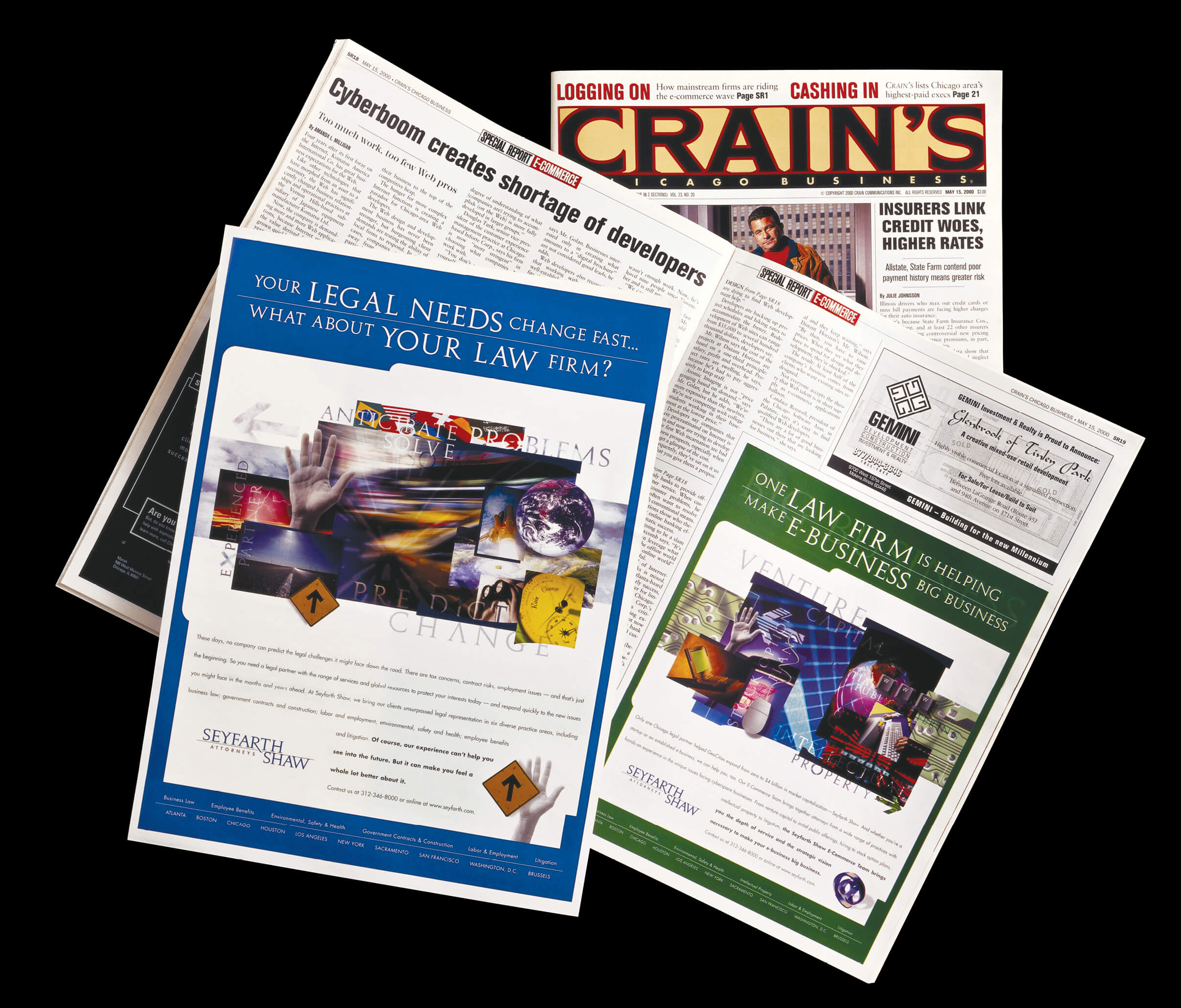
Advertising
These ads position both Seyfarth Shaw and its E-Commerce Team as a law firm aware of and equipped to deal with the ever-changing face of business, the economy, and the law — a modern, efficient and effective choice for all your legal needs.
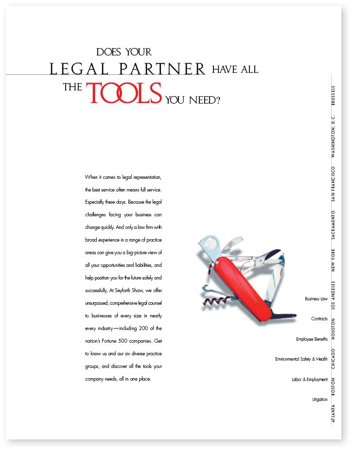
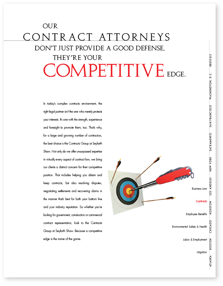
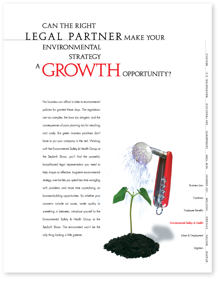
Concepts
These print ad concepts are part of the creative campaign that won DoubleTake Design the Seyfarth Shaw account and allowed us to completely rebrand the firm. Since one of the firm’s goals was to change the perception that it was a Chicago-based labor and employment law firm, this ad series showed that Seyfarth was a full-service law firm using the analogy of a multi-purpose pocket knife. Each of the firm’s practice areas would be represented by a different tool in the knife. Ultimately, the firm decided to go with a different approach, but many of the attorneys loved this concept and were interested in “owning” the pocket knife as the firm’s icon.
Want to make a stronger case to attract the right clients?
One of the goals of the rebrand was to change the perception that Seyfarth Shaw only did employment law, and only practiced in Chicago. On every marketing piece and advertisement we listed all of the firm's practice areas and offices, to reinforce that it was a national, full-service law firm.