The team of healthcare providers at PrairieShore Pain Center is inspired by a simple credo: “Do what is best for the patient.” Because their patients are dealing with the stress of pain, the doctors have created a spa-like, natural feeling in their office, with beautiful photos of nature and a calm, peaceful environment.
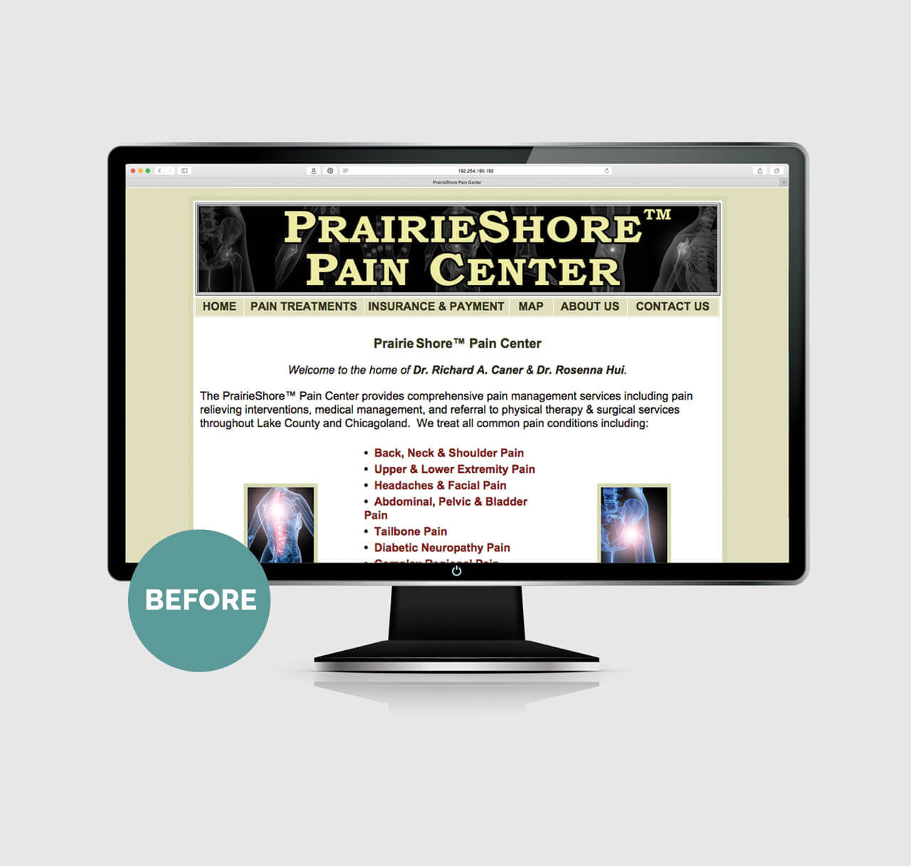
When we first met with PrairieShore, their website told a different story — with photos of angry, flaming spines and typography that was yelling their name. It did not match the business cards, which did not match the appointment cards. The doctors wanted a new, sophisticated logo that would better convey their philosophy.
Read More
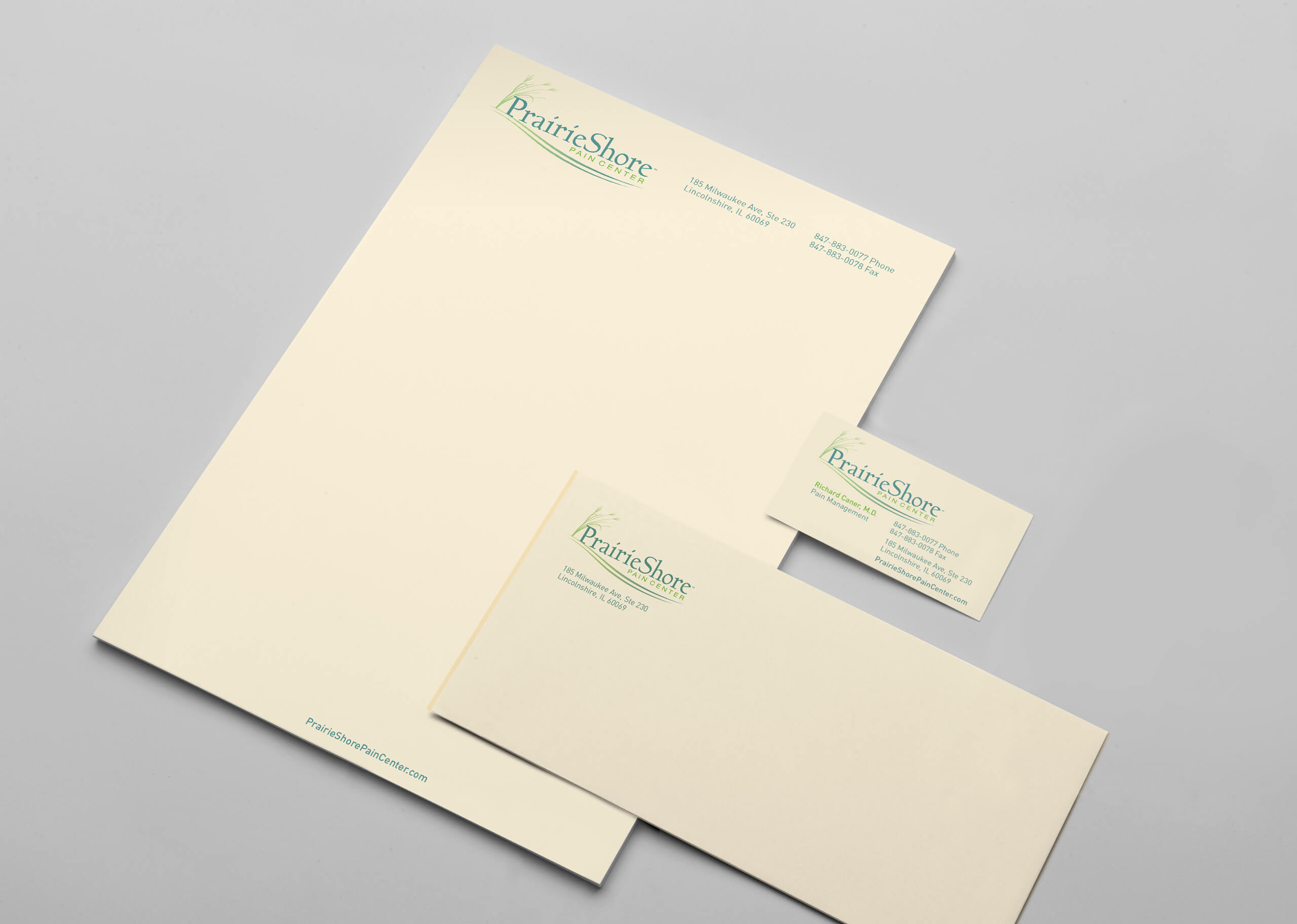
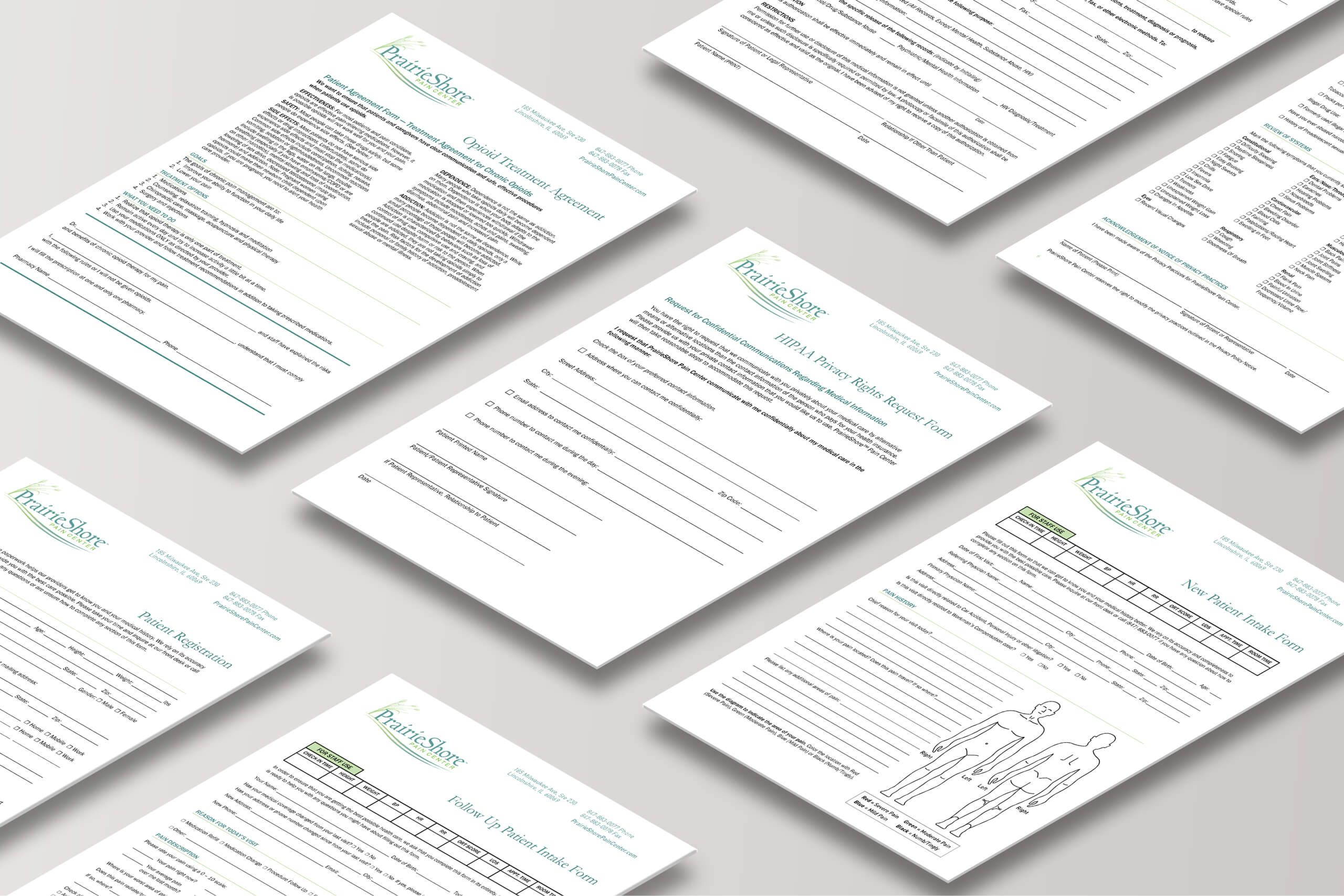
Our team presented several logo options, all based on prairie plants native to Illinois. The team selected their favorite, we provided some color variations, and PrairieShore ultimately selected the calm, cooling colors in the final logo shown here. We chose a warm, natural white paper for the stationery system and business cards with a nice tactile quality. The whole visual identity is designed to convey peacefulness, which the doctors strive to offer to their patients.
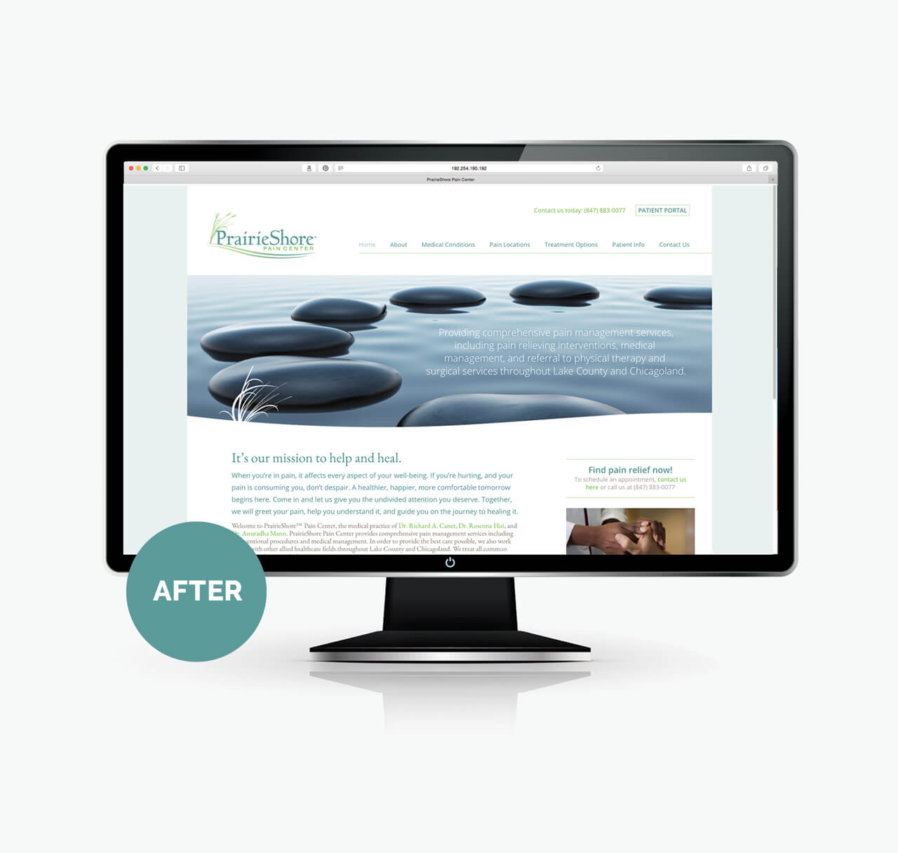
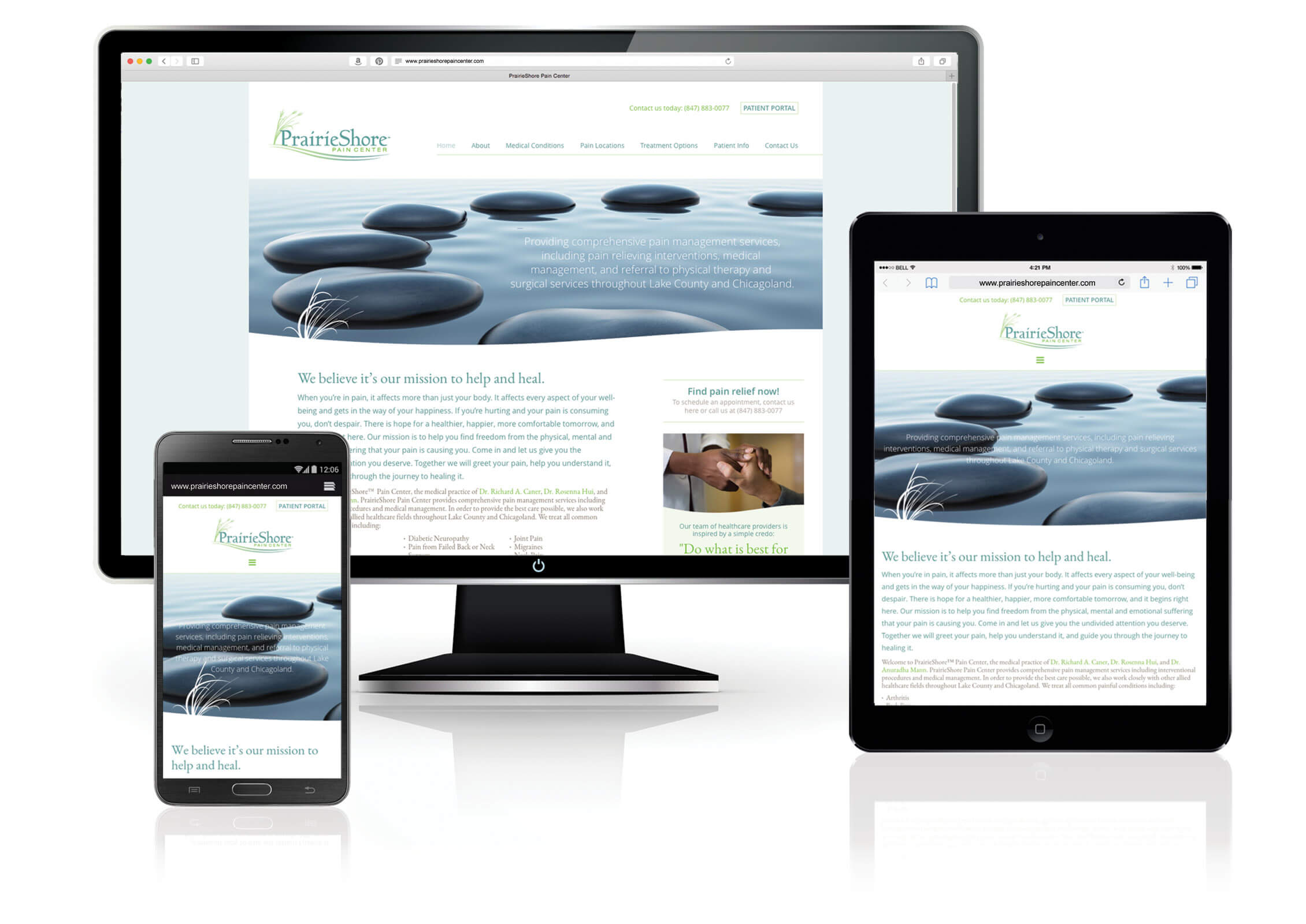
Next, we worked with them to design a new website, which includes a new Patient Portal, information about the medical conditions they treat as well as pain locations, and a very detailed FAQ section about treatment options. The site also has an extensive patient information section, which includes all of the patient forms, designed using all the same fonts and colors from the visual identity system so that everything is cohesive. Patients can make appointments on the website, and other doctors can refer patients using a form on the site, as well. The look of the site is very Zen-like and soft, and the photography and writing style convey a caring attitude.
We really enjoyed working with the doctors to create a brand image that matched their philosophy of caring for their patients.